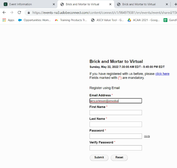
Events – Registration Page – Padding for the entry fields
Issue Description: Events Registration page does not seem to have enough padding on the left side of the content entry area. If someone’s email address starts with an “L”, “I”, or other very thin lower case character, the user does not see the letter and will get incorrect information.

Environment:
- Adobe Connect On-premise/ACMS and Managed ISP accounts
Solution:
There are two places where we can make the changes in the AEM Publish instance using CRX/DE. Either of them will work; JSP is easiest, but CSS is not difficult.
Provided paths are AEM CRDXE path. It will apply padding to all the fields in registration form for consistent look.
- JSP file
/apps/connect/components/eventregistration/eventregistration.jsp
Add below to the very top the page. This won’t require cache invalidation and it will be immediately shown to all the users.
<style>
.event_reg_field {
padding-left: 10px;
}
</style>
- CSS file
/etc/designs/connect/clientlibs/main.css
Add this at the bottom of the file. It will require to flush dispatcher cache otherwise it may serve old cached CSS to users
.event_reg_field {
padding-left: 10px !important;
}