 Do this. Don’t do that. Yep, this is another list of dos and don’ts to add to your life.
Following the below best practices will elevate your webinar registration and attendance conversion rates – helping to preserve your promotion and campaign investments.
So, without further ado, here are eight considerations when setting up your webinar registration:
Registration Landing page
Do use the event details page as your landing pad, especially if people are touching down on your registration site from a brief email or a banner ad. This event detail page if your chance to expand on the topic and specific learnings the prospective registrants can plan to take away. If potential registrants are coming to your registration microsite well informed from a very detailed webpage, pushing them right to the registration form makes sense.
Imagery
 Do design your registration microsite to match your promotional campaign. Matchy-matchy is fashionable in this instance in the name of increasing your conversion rates. As prospective registrants exit your excellent promotions (email, banner ad, or otherwise) and land on your matching registration site, the imagery will signify that they are in the right place and make them feel confident about landing on a potentially unfamiliar site.
Registration Form fields
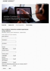
Do not create a massive registration form – too many fields to fill out can be a turn off for potential registrants. Do try to limit the fields to only the information you truly need. Consider collecting more information at later stages in the experience – such as during the webinar itself using a poll or in a post-webinar survey. If you use progressive profiling, use the webinar registration as just one opportunity in this process. Do limit the length of any dropdown menus – if they are too long and burdensome, the likelihood of accurate information will decrease. The exact number of fields appropriate for your program will need to be determined with testing. In our own program we gained a 3% lift in registration conversion (from landing on the microsite to completing registration) when we decreased our registration form by seven fields (our dropdowns were already limited).
Passwords
 Do not use passwords for large public marketing webinars – if it’s public, it’s not top secret. Unnecessary barriers are your enemy, making registration and attendance burdensome and lowering the conversion rates for both. Do consider one exception: If your program has a large proportion of repeat registrants, a persistent profile accessed with a password may benefit your potential registrants by saving them time.
Confirmation Landing Page
Do boost your attendance rate by spending the time and brainpower to create a well thought out confirmation landing page for registrants who submit registration. Do include all event time/day details (including the time zone) as well as how to join on the day of the event. Ideally, include a link to an Outlook calendar invite on this page. If appropriate, it may be helpful to include a way for registrants to test their computer for compatibility with the webinar platform, including a way to download any necessary add-ins. Putting all the information on this landing page mitigates damage caused when confirmation emails get snagged by dreaded spam filters.
Confirmation Emails
Do apply the above recommendations to confirmation emails, including, and most importantly, an Outlook calendar invite. Do use a subject line that clearly identifies the email – go with obvious over creativity: such as ‘Webinar Registration Confirmation: Webinar title’. Ensure that your ‘From’ name is also easily identifiable like your company name. Do not use such ‘From’ names as ‘Admin’, ‘Webinar Registration’, or something equally generic and unidentifiable. Half the battle is getting registrants to open the confirmation email. Trust me – you want that Outloook calendar invite on their calendar to block their time and remind them to attend. Sometimes Outlook is our friend. In our own program we use ‘Adobe Webinars’ as the ‘From’ name. Do not use the name of the webinar organizer unless that person is very well known to your audience. Do use a do-not-reply email for the Reply-To-Email for both the confirmation email as well as the Outlook invite to avoid littering the webinar organizer’s inbox (unless providing a personalized experience is a goal – usually for smaller events).
Reminder Emails
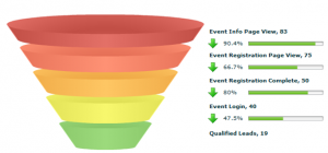
 Do – yep you guessed it – include the same information and follow the guidelines recommended above in the reminder emails – although an Outlook invite is not necessary at this point. Do send at least two reminder emails – 24 hours before the live event and one hour before the event. Some program managers even send a reminder five minutes before the event. Reminder emails will back up your other efforts to help increase attendance. Using this method and the above techniques, we typically get 36% attendance rate which is fairly close to the industry average high of 40% (range is 30-40%). Do test and compare your registration conversion and attendance rates to prove what works for your program.
Waitlists
Do ensure you have set up registration properly if you have limited capacity so the resulting communications clearly spell out what to expect for those registrants that get a rejection from a ‘Full’ event. Do plan out how will you handle the overflow. Will they be automatically added to a waitlist and how will they be notified when they’ve been promoted off the waitlist? Or are they just out of luck? Will you offer more sessions and, if so, when? Will you send the waitlisters a recording of the webinar? While not making the cut may be frustrating, your clear communication will help ease the rejection. An overly full event is certainly not the worst problem, but your communication, or lack thereof, will leave a lasting impression – make it a good one.
May all your future registration and attendance conversion rates go up and to the right!
Adieu!
