The summer is flying by and with it comes an exciting new release of Adobe Connect. Version 12.7 rolls out to customers at the end of July and into the first week of August and brings some welcome new updates.
Event Analytics Dashboard
While we’ve leveraged Adobe Analytics for Event Analytics for some time now, the new release brings new insights organized in a cleaner modern interface. The new Event Analytics Dashboard will provide you with an easy-to-read set of reports to show you the level of participant engagement in your session.
An Engagement tab will show you the aggregate level of engagement across your event – and highlight the individual layouts that were being used at the time. Above that, the key metrics will highlight how many registrations you had compared to attendees – and how many of those attendees were engaged during the session. Below the engagement chart, you’ll also find a summary of the attendee interactions – showing what percentage of attendees answered polls, asked questions, interacted with chat, clicked a link, or downloaded a file.
The next tab – Interactions – breaks down those interactions into more detail. Showing specifics for each and every poll as well as more details for your Q&A, Reactions, Web links, and File pods.
Participant Activity gives customers a new way to see all participant actions on a single screen. You’ll see a list of participants, their engagement level for the session, the duration attended, and the number of polls answered, files downloaded, links clicked, and questions asked.
Simplified UI
While we strive to improve our user interface in every release, version 12.7 brings some significant changes to the Adobe Connect UI. We’ve looked at every menu, every preference dialog, and every label, in an effort to remove duplicates and make the interface more intuitive.
While there are too many changes to list in this blog post, some of the highlights include:
- Meeting name moved from meeting menu to the title bar. Meeting menu now has a standard, consistent icon.
- Meeting menu, Pods menu, and each pod options menu have been redesigned to ensure the items are arranged by category and the most commonly used functions appear at the top. You’ll also notice new icons in many menus to make it easier to find specific items.
- Menu items have been renamed to match industry standards or to be more clear and accurate. For example, the Host and Presenter Area has been renamed simply to ‘Backstage’.
- Some preferences have been removed if they are no longer required. For example, we will always buffer your MP4 video for smooth playback – there’s no need to ensure that option is selected. Similarly, in 2024, nobody wants to choose 240p for their webcam resolution. We’ve gone through the preferences with a fine tooth comb improving many of the options.
- The option to include you system audio when screensharing has moved from being a dropdown option under ‘Share’, to a checkbox on the screenshare dialog – making it much easier to discover and select.
- For a complete list of changes, you can check out this resource.
Account Customization Options
The UI for account customization has also been redesigned, and the new cleaner interface brings additional options for customization.
The new interface enables an Administrator to set the background image for login, entry, and exit separately – allowing for multiple options to be used. All logos and backgrounds now also support the SVG filetype.
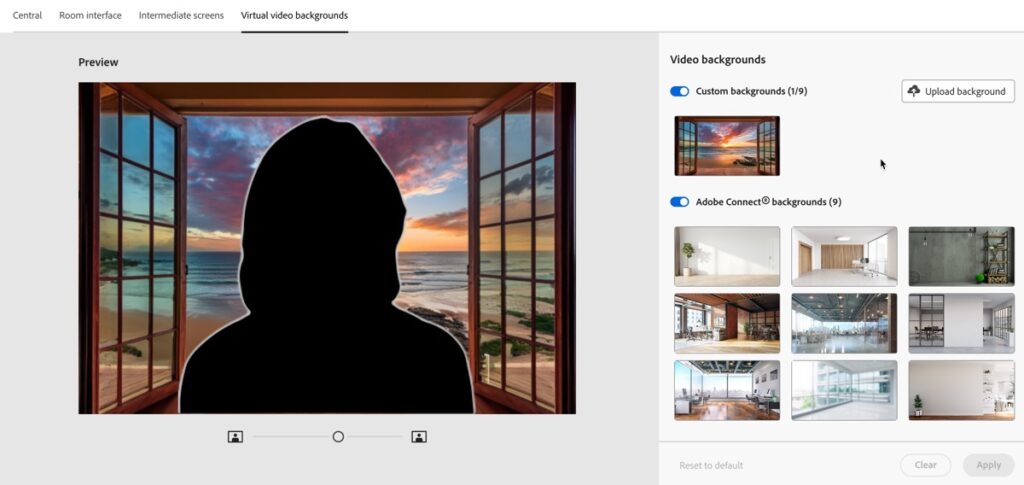
We’ve added a new section under Customization specifically for Virtual video backgrounds – and I’m pleased to announce that Administrators can upload up to 9 of their own custom backgrounds to be used on the account. They also have the option to toggle whether they’d like to use their own custom video backgrounds, the built in Adobe Connect video backgrounds, or both.

Note that 12.7 now mirrors your webcam, including the background, by default – so you may want to take that into consideration as you use custom backgrounds with text.
And More
As always, there are many more features in this release. Some additional highlights include:
- A new option to optimize screen share for video clips. This option is off by default since it uses more bandwidth, but it increases the frame rate of the screen share so that video will play more smoothly.
- You can now create a link to a recording that starts playback at a specific timestamp by appending ‘archiveOffset=[milliseconds]’
- As mentioned above, the camera video will now automatically be mirrored by default. Users still have the option to turn off mirroring. Video feeds will also now default to a 16:9 aspect ratio instead of 4:3.
