We’ve seen a huge increase in the number of breakout rooms used in the last 3 years. Breakout rooms enable social learning – giving learners an opportunity to share their experiences and work together.
Adobe Connect 12.3 introduces a new Breakout Bar for all participants when breakout rooms are active. The goal of this new control is to:
- Make breakout room functions easier to find and use
- Optionally enable participants to select their own breakout room.
In previous versions of Adobe Connect, Breakout Room functionality was available by clicking on the Breakouts icon in the application bar. While I personally loved the design of this icon, its resemblance to the Adobe Connect logo made it subtle and non-intuitive, especially for new users.

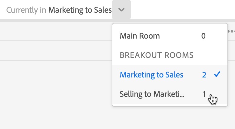
Adobe Connect 12.3 adds a more overt user interface element near the top of your screen (regardless of your role) indicating that breakouts are active and displaying your current breakout room.

Hosts will be able to easily move themselves to a different room. They can also broadcast a message to everyone across all breakout rooms or choose to end breakouts. These options continue to also be available in the Attendees pod as well.
Participants will also see that breakouts have started, which room they’re in, and will have a button to send a message to the hosts
Another new feature in Adobe Connect 12.3 is a new option to enable participants to self-select which breakout they’d like to join.

While this option is off by default, enabling it will give participants the same drop-down selector so that they select their own breakout.

Breakout rooms in Adobe Connect continue to leverage all of the best features of Adobe Connect. They’re persistent, so you can set them up days/weeks ahead of time and re-use them. They’re infinitely customizable, so you can design a breakout layout to perfectly suits your needs – or customize each breakout room with a different exercise and design.
We hope that Adobe Connect 12.3 makes them easier to use and even more flexible.
