In Adobe Connect 8, we introduced a new aspect ratio that allows for optimum viewing. The Adobe Connect meeting interface rescales intelligently to provide optimum viewing experiences for any screen size or resolution.
We’ve received great feedback on this change that enables the product to scale but maintain aspect ratio. At the same time, users who created customized wallpapers for Adobe Connect 7.5 or earlier may have noticed them stretching the original branded appearance. With that in mind, I wanted to share some tips for those who like the ability to customize and brand their Adobe Connect meetings (and also point you to some of our own backgrounds…but more on that later):
– Background file types supported are: JPG, PNG, GIF and SWF.
– The name of the background file should be 50 characters or less.
– The background scales with the size of the meeting client window. Different client views are determined by screen resolution.
– Aspect ratio is always honored, which means the largest dimension dominates so there is never a blank space. Keep in mind, this is what can cause an image to truncate.
– You can use Adobe Illustrator to create a vector-based wallpaper image that scales beautifully at any size. You should save for web and choose SWF as the format. SWF backgrounds are very lightweight but the trick is getting the aspect ratio correct – again, Adobe Connect 8 meetings are no longer of a fixed ratio and, as a result, it may take some tweaking as you go.
– Use a higher resolution when creating pixel-based wallpaper images in Photoshop. You’ll typically achieve better results scaling down than scaling up. We recommend using 1920×1200, which works well – note this means it will scale down on monitors with lower resolutions and scale up on 27″+ monitors. (Bear in mind bitmaps are not supported).
– It’s best to keep the background file size small. The size of the background file impacts required bandwidth and attendees will download this file as part of joining the meeting.
– As a best practice, in large meetings of over 300 participants, hosts should consider removing backgrounds, which saves bandwidth usage and results in a better participant experience for those on slower connections or older computers.
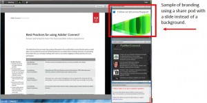
– Adobe Connect 8 offers a larger viewing area so it’s also quite simple to add an additional share pod where you can upload a simple .PPTX with your preferred branding. This looks great, for example, in the upper right-hand corner of an Adobe Connect meeting room. (See image below)
As I alluded earlier, we’ve created some nice Adobe Connect backgrounds ourselves that you can download from the ConnectUsers.com site here and place in your Adobe Connect room (to download, click on the gallery thumbnail image of interest, then right-click on the large image and choose “Save Image As…” from your browser). Backgrounds in Adobe Connect are associated with a particular room only to allow multiple users within an account to brand as they wish.
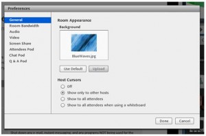
To change the default background in an Adobe Connect meeting, as a host, go to the top menu.
- Choose Meeting > Preferences.
- Click upload, then navigate to the desired image. If you haven’t previously added the file to Adobe Connect, click Browse My Computer.
It is important when creating a background to note there is a way to anchor your background to one of the four corners. The default anchor point is the bottom left corner.
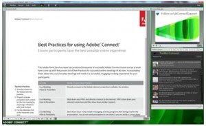
For example, if you want to fit a square image in a 4:3 Adobe Connect meeting room window like the sample below, choose a background where you place the logo in the bottom left corner.
Since the anchor default is the bottom left corner, you can see the image fits nicely.
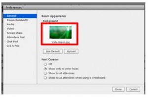
If you find your image is being cropped on the top or side, you can change the anchor point to the corner that best suits your background image. To change the anchor point, in your Adobe Connect Meeting room, go to Meeting > Preferences and you will see a box that looks like the image below. Double click on the preview image (see red rectangle in image below). This will change the anchor point. Watch your image closely after double clicking and you will see the adjustments to the background in the window. Please note anchor points can be similarly changed for SWF files used as background images, however note the preview image is not updated in the preview window.
I hope you’ll find this post helpful and of interest, and that you’ll check out and enjoy the backgrounds I discussed. As always, let us know your thoughts in comments and on Twitter @AdobeConnect and @ConnectSupport.
Amy Brooks, Adobe Connect Event Producer


