By Vincent Toesca, Group Product Manager, Adobe Connect
Easy is hard. This seemingly contradictory statement could capture well our efforts to simplify our award-winning online meeting and training solution with the release of Adobe Connect 8.
While our previous versions had been praised for providing a sleeker and more user-friendly experience than comparable products, we spent a great deal of time meeting with our customers and listening to one simple but enlightening message they delivered to us: “the feature set of Adobe Connect is much richer than any other; we don’t need more, but better.”
Not more but better. Over the past months, we have worked intensively with Adobe’s user experience researchers, interface designers, engineers and, of course, existing Adobe Connect users to understand how we could improve user interactions and make our meeting interface even more intuitive, especially for casual users. The advent of consumer tools such as public instant messaging networks and IP-based phone-call services, and the smarter form factor of novel electronic devices have accustomed us to simplified digital experiences. We strived to remodel Adobe Connect along those lines, while maintaining our rich set of options for power users.
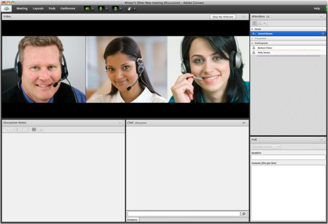
Our new meeting user interface not only offers a more compelling design and fresher look but also achieves a better organization and more prominent display of important and frequently used controls and capabilities. Here are a few examples:
- Enhanced audio and video controls. These settings have been regrouped to be accessed from one central place. Now organized at the top of the meeting bar, they are more visible and easily accessible.
- Unified attendee management. All participant management functions can be executed from the Attendee pod, including breakout-out rooms. Participant role and rights can now be updated using drag and drop; a rollover menu enables participants to quickly initiate actions, such as private chats, with each other.
- Optimized screen use. The meeting interface rescales intelligently to provide optimum viewing based on each participant’s screen resolution. Presenters can also size their own version of the presenter-only area individually without impacting the view of other presenters.
- Improved accessibility. Navigation via keyboard and hot keys has been improved and major improvements have been achieved in screen reader compatibility with JAWS and Win-Eyes.
- Advanced chat. Text-based conversations within the meeting room have been reorganized into separate tabs for public and private conversations.
- Rich Notes pod. Rich formatting capabilities have been added in the Notes pod to facilitate the capture of notes and comments during collaborative meeting, save them as rich documents and send them by email after the meeting.
- Simplified Q&A pod. The submission and management of questions during webinar-like sessions has been consolidated into one single frame, with differentiated views for presenters and participants.
- Enhanced Whiteboard. New workflows, such as quickly adding text to custom shapes, have been added. The whiteboard can also be used in the overlay mode on top of a shared document to zoom and pan along with the document.
In this simplification process, we have made sure to preserve all the key workflows that Adobe Connect users have come to rely upon for their meeting and training needs. But overall, they are now easier to discover and use.
Not more but better, I wrote earlier. But a little more too, in this new release. New back-end capabilities, such as integration with videoconferencing systems, duplex universal voice and enhanced room access protection, are hallmark features of Adobe Connect 8. They enable our customers to leverage their existing investments in adjacent communications systems, such as audioconferencing and videoconferencing platforms, and provide their employees and partners with a more unified and coherent digital experience for collaboration.
In future posts, my team and I will be glad to continue to walk you through the new benefits of Adobe Connect 8. We look forward to having you use our new version. Our official trial will be available very soon, but if you’d like to get a sneak peek now – you are invited to sign up for a free 30-day account offered as part of our customer preview program. If you are a current customer, we have created the Adobe Connect 8 Migration Center to help you prepare for the new version. If you are a Hosted Services customer, we have a widget on that page that you can use to look up your anticipated upgrade date.
We hope you will enjoy Adobe Connect 8 with the same excitement and enthusiasm as we put into building it.
